If appearances don’t matter, then why am I such a complete and total whore for good packaging? I have been known to buy wine for a great label, a book for its cover art, clothing because I like the design of the label — no, I mean the actual label. The one stitched INSIDE the garment.
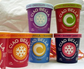
Business Week provides a textbook example this week with the makeover of Ciao Bella. I remember seeing this gelato in its previous incarnation, its cartons a schizoid array of squiggles that made it seem like a bad New Year’s Eve decoration. But oh how my head turned when they rolled out this simple, stop-in-your-tracks redesign:
So crisp! So clean! As if the design doesn’t speak for itself, Oprah gave it her huge mega-endorsement last year. But leaving her out of it, don’t you just love the simplicity, the bold colors and the great flavor descriptions? Easy on the eyes, easier to get into my basket.
Boutique frozen treat makers seem to have me nailed. I would never have looked twice at goat milk ice cream if not for the postmodern Swiss-Missishness of Laloo and its stealthy chic flavors. Just you try to resist the siren call of Black Mission Fig or Chocolate Cabernet. That’s what I thought — see you in the freezer section.
Filed under: blissful excess, food & drink, Uncategorized | Tagged: stealthy chic |


Leave a comment